Amelia is a skilled writer specializing in AI, creating engaging content that informs and inspires. She stays ahead of the latest trends to help businesses connect with their audience in a rapidly evolving digital world.
The modern internet runs on tools. Code formatters, image compressors, JSON validators, text-to-speech generators, QR code makers, and PDF converters. There is a free browser-based tool for virtually every digital task imaginable. People who use online tools regularly tend to be optimisers by nature. They are the ones who test three different screenshot apps before settling on one, who compare a dozen colour palette generators, and who bookmark utilities they might need someday. It is a good instinct. The right tool at the right time saves hours.
But there is a category of online tools that almost nobody in this audience has explored, one that does not compress a file or convert a format, but delivers a financial return that makes every other free tool look trivial by comparison. That category is structured exam preparation for professional certifications.
The Tool Nobody Thinks Of
The Bureau of Labor Statistics has tracked a consistent wage premium for workers with professional certifications or licences: roughly 16 per cent more than uncertified workers in the same occupation. On a $50,000 salary, that premium is $8,000 per year. On a $70,000 salary, it is $11,200. The certifications behind those premiums in healthcare, IT, construction, education, and finance typically cost between $100 and $500 and can be earned in three to six months.
The exams behind those certifications are standardised, proctored, and designed to verify genuine competence. And the most effective preparation tool for passing them is exactly the kind of thing this audience already uses every day: a free, browser-based platform that you access, use, and benefit from without installing anything. The format is practice tests, structured question sets that simulate the real exam, provide instant feedback, and help candidates identify knowledge gaps before sitting the actual test.
Why It Works Like Every Other Good Tool
Think about what makes any online tool effective. It is accessible without friction, no download, no signup wall, no learning curve. It solves a specific problem. And it delivers a result you can use immediately. Exam prep platforms work exactly the same way. A candidate studying for a cloud certification, a food handler card, or a safety supervisor credential can access practice exams in a browser, work through questions at their own pace, get instant feedback on their answers, and walk away knowing exactly which topics they need to review before the real exam.
The cognitive science behind practice testing what researchers call the “testing effect” shows that the act of retrieving information under test conditions produces stronger, more durable learning than passive review. Every question you answer on a practice test is an active learning event, not a passive reading exercise. The tool does not just check your knowledge. It builds it.
The ROI Comparison
Let’s put the numbers side by side. A colour palette generator saves you 15 minutes of design time. A PDF compressor saves you email attachment headaches. A code formatter saves you a few seconds per file. All useful. All worth bookmarking. But a practice test platform that helps you pass a professional certification exam, which unlocks an $8,000 to $11,200 annual wage premium for the cost of a few hours of focused study, delivers a return that no file converter or image editor can touch.
The preparation costs nothing or close to nothing. The certification exam costs $100 to $500. The annual earnings increase exceeds the total investment within the first few weeks of the new salary. And unlike a tool you use once and forget, the credential generates returns for every year you work in that field.
Add It to the Toolkit
The instinct to collect useful online tools is a good one. It reflects a mindset that values efficiency, self-improvement, and the belief that the right resource at the right time can make a measurable difference. Exam prep platforms belong in that toolkit not as a replacement for the code editors and format converters you already use, but as the one tool that converts your existing knowledge into a credential the job market rewards with higher pay. You have already bookmarked the tools that save you time. This is the one that pays you back.
Choosing the right fundraising CRM system is the most consequential technology decision a nonprofit leader will make to ensure long-term donor loyalty and operational growth.
In the world of modern philanthropy, the margin for error is thinning. Lean teams are being asked to do more with less, data complexity is exploding across digital and physical channels, and donor expectations have shifted. Today’s supporters don’t just want to give; they want to be known. They expect every interaction with your organization to reflect their history, their passions, and their previous impact.
This is why the CRM must be viewed not merely as a digital filing cabinet, but as a fundraising multiplier. It is the infrastructure for relationship building, the engine for strategy, and the foundation for sustainable growth.
However, not all CRMs are created equal. To move from manual spreadsheets to a thriving donor ecosystem, you need a roadmap to identify a system that transforms your data into your greatest fundraising asset.
Step 1: Start With a Centralized Donor Database
The foundation of any successful fundraising operation is a single source of truth. When donor data is scattered across disparate spreadsheets, disconnected email tools, and the tribal knowledge of individual gift officers, stewardship suffers. If a major donor receives a generic appeal because their recent pledge wasn’t recorded in the main system, trust is eroded instantly.
A centralized database must be the non-negotiable core of your search. You need one authoritative system that captures:
Comprehensive Giving History: Every gift, pledge, and soft credit
Engagement and Interactions: Meeting notes, event attendance, and email opens
Relationships and Affiliations: Family connections, corporate ties, and board memberships
Institutional Knowledge: Ensuring that when a staff member leaves, the history of the donor relationship stays with the organization
When data is centralized, you unlock the ability to provide consistent donor experiences and accurate forecasting.The purpose-built fundraising CRM Ascend by Kindsight provides this essential foundation by serving as a unified, centralized data platform that eliminates fragmented records across all teams and touchpoints.
The need for a single source of truth is underscored by a sobering reality: the Fundraising Effectiveness Project consistently reports that the nonprofit sector struggles with a donor retention crisis, with rates often dipping below 45%. Without a centralized CRM to track and nurture these relationships, nonprofits are forced into a costly cycle of constant acquisition just to stay level.
By ensuring your single source of truth is built-in rather than bolted-on, Ascend removes the need for the manual workarounds that plague legacy systems, allowing your team to focus on donor relationships rather than data reconciliation.
Step 2: Choose a CRM Purpose-Built for Nonprofit Fundraising
One of the most common mistakes nonprofits make is attempting to force-fit a generic business CRM into a fundraising context. While commercial CRMs are powerful, they are built for sales cycles, not donor journeys.
The customization trap is real: the more you have to modify a generic system to handle soft credits, split gifts, or householding, the higher your technical debt and the slower your staff adoption becomes. A purpose-built fundraising CRM understands the nuances of:
Moves Management: Tracking a prospect from identification to solicitation
Complex Gifting: Handling pledges, matching gifts, and recurring donations
Campaigns and Appeals: Linking every dollar directly to the initiative that inspired it
Step 3: Look for Workflow Automation That Protects Staff Time
Administrative overhead is the silent killer of fundraising productivity. If your gift officers are spending 40% of their week on manual data entry or gift processing, they aren’t out in the field building relationships.
Look for a CRM that offers high-value automation, such as:
Automated Gift Processing: Reducing the manual steps from check received to receipt sent
Task Creation: Automatically alerting a solicitor when a donor makes a milestone gift
Data Validation: Tools that clean addresses or flag duplicate records in real-time
Automation isn’t just about efficiency; it’s about protecting your staff from burnout and freeing them to focus on the human side of philanthropy.
Step 4: Prioritize Active Donor & Prospect Management
Data alone is useless if it doesn’t tell you what to do next. The best CRM systems act as a GPS for your fundraisers. Instead of just showing a list of names, the system should offer prospect prioritization and suggested actions.
For major gift officers and mid-level managers, this means having a dashboard that highlights which donors are drifting (slipping in engagement) and which are ready for an upgrade. This proactive guidance ensures that no high-potential supporter falls through the cracks.
Step 5: Demand Robust Reporting and Fundraising Analytics
If you can’t measure your performance, you can’t improve it. Many nonprofits struggle with slow reporting, in which pulling a simple retention report takes hours of manual Excel manipulation.
Your CRM should provide real-time visibility into:
Retention and Upgrade Trends: Who is staying, who is leaving, and who is giving more?
Portfolio Performance: How are individual gift officers tracking against their goals?
Campaign ROI: Which appeals are actually driving revenue after expenses?
Strong analytics create a culture of accountability and allow leadership to make data-driven decisions rather than relying on gut feelings.
Step 6: Ensure Gift Processing Can Scale With Your Organization
As your organization grows, so does the complexity of your financial operations. A CRM that works for 1,000 donors may buckle under the weight of 50,000.
Look for a system that supports bulk processing and flexible pledge schedules. Scalability also means having the controls in place to reduce errors and ensure that your finance team and development team are always in sync. A CRM that can’t scale becomes a bottleneck that eventually stifles your mission’s growth.
Step 7: Evaluate Data Security, Compliance, and Needs
Data security is a boardroom-level issue. This is especially true for institutions in healthcare or higher education that must navigate HIPAA compliance and complex permission-based access.
Ensure your CRM provider has a proven track record of handling sensitive data. For complex institutions, you need the ability to silo data where necessary (e.g., protecting patient privacy) while still maintaining a holistic view of the donor’s relationship with the institution.
Step 8: Consider How the CRM Supports Personalization at Scale
Donors are increasingly comparing their experience with your nonprofit to their experience with brands like Amazon or Netflix. They want personalized content, relevant outreach, and perfect timing.
A modern CRM enables segmentation at scale. By using data to trigger specific content based on a donor’s interests or past behavior, you create a sense of intimacy that is a massive competitive advantage in donor retention. When you treat a donor like an individual rather than a record number, loyalty follows.
Step 9: Look for Strong Integrations
No CRM is an island. Your fundraising stack likely includes wealth screening tools, donor portals, and email marketing platforms.
The best-of-breed approach only works if your CRM acts as the hub. Look for a system with an open API or pre-built integrations with tools like wealth and prospect research modules. When your research data flows directly into your CRM, your fundraisers have a 360-degree view of a donor’s capacity and inclination without ever switching tabs.
Step 10: Plan for the CRM You’ll Need in Five Years
The most expensive CRM is the one you have to replace in three years because you have outgrown it. When evaluating vendors, look past the features and look at the partnership. Does the vendor have a roadmap for innovation? Is the platform flexible enough to adapt to new fundraising trends, like crypto-giving or AI-driven outreach?
Choose a partner who views your success as their own. A long-term CRM investment should feel like a tailwind, pushing your organization toward its five-year and ten-year goals.
The Right CRM Turns Data Into Donor Relationships
At the end of the day, fundraising is about people, not points of data. But in a digital-first world, you cannot reach people effectively without a trusted, centralized record of who they are and why they care about your cause.
The right CRM (one that is purpose-built, automated, and scalable) does more than just track gifts. It enables strategy, empowers your staff, and turns cold data into warm donor relationships.
The power of first impressions is massive when acquiring new followers, whether you are a creator, entrepreneur, or influencer. Your potential followers decide if they will follow you within three seconds of visiting your account. Your profile and content taken within that short time frame will either encourage or deter them from following you.
To have a professional online presence, you need to have an optimized profile and valuable content that will not only attract attention quickly but will also help you grow in the long run. In this article, you will find smart strategies like optimizing what people see first, brave prototypes, and the use of the right tools and formats to make things simple and effective and to help you draw attention and improve your conversions as a follower.
Optimize Your Profile for Instant Trust
You can win the trust of someone subsequently with a carefully crafted profile. A clear profile picture showing your face makes your account feel more genuine. The bio you write should be concise and indicate what value you give without being vague. You should show your niche in the first few words so your visitors will know what to expect.
It will be wise to display social proof, such as follower numbers, featured publications, or collaborations in influential spaces, to show a slightly recognized stature. To retain a professional vibe, perfect the look you have and the type of language you use on various platforms. All these moves tell a stranger that he is mistaken by not following you.
Create Thumbnails and Visuals That Stop Scrolling
In the case of visuals and thumbnails, a picture must be strong enough to stop people in their tracks and make them ask to look at more. Bright color schemes with good contrast cause a visual stir and make your account stand out in a feed cluttered with content.
Textual elements should be kept legible and must be few in numbers so that scrollers do not lose interest. Emotive imagery, together with a little motion, can make posts that inspire impressions. The use of the analysis tools to understand what connects to the audience most can be insightful. Also to optimize your visuals it will be wise to preserve a combined look so every piece of work will be instantly recognizable to your style.
Hook Viewers in the First Moments
You can only win or lose an audience in the first few seconds of their engagement with your content. The moment you start a video or post with a strong statement, it creates a crucial environment in which the audience is more likely to remain curious.
Questions are also an immediate gateway to engagement, making viewers feel personally invited to continue the conversation. Your videos must show the time value of following you and give the audience a taste of what your specific work would contribute. Call for immediate action gives a post an additional purpose and prompts an instant decision. Use the hitch of quick movement, or sound in your post to amplify engagement.
Build Credibility Quickly
You could earn the respect of anyone trying to engage with your content the moment you demonstrate that you are knowledgeable and dependable. A short post or video that highlights your expertise establishes you as an authority in your selected topic of interest. Pointing out your achievements and collaborations helps to underline that you are recognized and people will also be willing to listen to you.
Small social proof such as the number of views indicates your value without your bragging. Authentic testimonials or organic mentions by others create a real feel to your credibility build-up process. The excitement of sharing what you know with others while remaining true to yourself is what is referred to by many.
Leverage Platforms and Tools for Exposure
Knowing how to use platforms to your advantage can make a significant difference in your follower growth in a short period. It is important that you post at the hours when most of your current followers are online so that you make the best out of engagement. Sharing across different channels allows you to get more eyes on your work.
You must also try your hand at formats that are trending such as reels and others, as they have an inbuilt audience on many platforms. Smart, subtle boosts may be helpful to extend the reach of your top posts. Tools that grow your followers like Mixx and others do not lead to fake or dangerous growth in carrying out the process efficiently and in a safe manner.
Conclusion
With a combination of tactical profile management to eye-catching visuals, you only have seconds to do an excellent follow burst. To trap the attention and intelligence most expeditious is to marry the presentation and the first pieces of content so as to prepare the audience for what is to come next. You will also win people’s trust, turn them into followers, and build a follower community by offering real value on a timely basis.
It is important to monitor the results of your efforts to see what generates real connections and to establish a flexible growth-oriented strategy. When executed properly, your planning will transform anonymous browsers into real supporters and patrons.
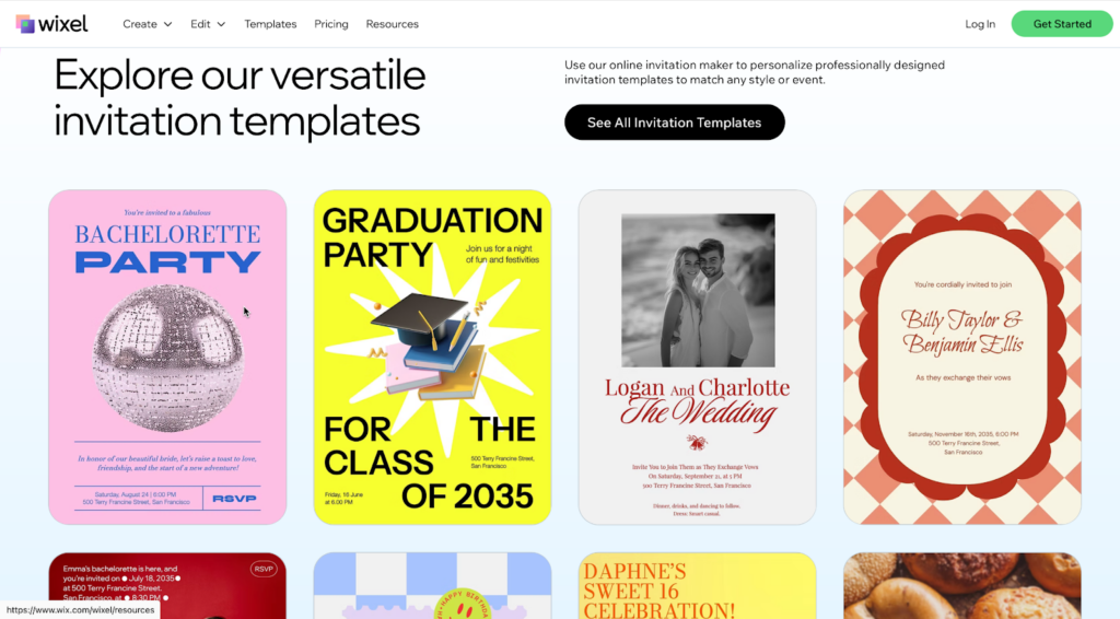
You get an email or open an envelope. Inside is an invitation. Before you even read a single word – before you know who is hosting, what the occasion is, or where it’s happening, you have already made a snap judgment. You instantly feel a vibe. Is this going to be a stuffy corporate meeting? A wild party? A fancy gala?
That gut feeling isn’t magic. It’s psychology.
Every choice you make when designing an invite, from the shade of blue to the curve of a letter, sends a signal to your guest’s brain. These visual cues trigger emotions and expectations. Most importantly, they influence the one thing you care about most: whether that person clicks “Yes” or “No.”
Design isn’t just about making things look good, it’s a powerful tool for communication. By understanding how the human brain processes visual information, you can create invitations that not only grab attention but drive action. With the right invitation maker, you can master the use of colors, fonts, and layouts to turn a “maybe” into a definite “yes.” Let’s explore the science behind designing invitations that get results.
The 50-Millisecond First Impression
Science tells us that people form an opinion about a visual design in about 50 milliseconds. That is faster than the blink of an eye. In that tiny sliver of time, your guest decides if your event looks professional, exciting, or boring.
If your design feels cluttered or chaotic, the brain’s immediate reaction is to pull away. This is known as “cognitive load.” When something looks hard to process, we subconsciously label it as “work.” You never want your party to feel like work.
On the other hand, a clean, balanced design signals ease. It tells the brain, “This is organized. This will be fun. This is worth my time.” Your goal is to reduce that cognitive load so the path to the RSVP button feels like a slide, not a staircase.
Color Psychology: Setting the Mood
Color is the loudest voice in the room. It is the first thing we see and the element most tied to memory and emotion. Different colors stimulate different chemical reactions in the body. Understanding this can help you pick a palette that matches your event’s goal.
Red and Orange: Urgency and Energy
Warm colors like red and orange are physical stimulants. They can actually increase heart rate and blood pressure slightly. They scream energy, passion, and excitement.
If you are hosting a launch party, a concert, or a limited-time sale, these colors work wonders. They create a sense of urgency (FOMO is real). However, use them sparingly. Too much red can signal danger or aggression. It’s often best used as an accent color for your RSVP button to make it pop against a neutral background. This is called the “Von Restorff effect,” or the isolation effect, which predicts that an object that differs from the rest is most likely to be remembered.
Blue and Green: Trust and Harmony
Cool colors are the heavy lifters of the corporate world for a reason. Blue is universally associated with trust, stability, and calm. It lowers the heart rate. If you are asking people to commit their time or money to a professional workshop or a fundraiser, blue reassures them that you are legitimate and organized.
Green, naturally, connects to growth and balance. It’s perfect for wellness retreats, outdoor events, or anything related to sustainability. It tells the guest to expect a refreshing experience.
Black and Gold: Exclusivity and Luxury
Want to charge a high ticket price? Black is your best friend. In design psychology, black signifies sophistication, mystery, and substance. When paired with metallic accents like gold or silver, it creates a perception of high value.
This combination signals that the event is exclusive. It tells the guest, “This isn’t for everyone; it’s for you.” It primes them to dress up, spend money, and expect a premium experience.
The Contrast Factor
Regardless of the colors you pick, contrast is non-negotiable for RSVP rates. If you put light gray text on a white background, you are asking the reader’s eyes to work hard. Remember cognitive load? If they have to squint to read the date, they are less likely to commit. High contrast, like dark text on a light background, improves readability and makes the decision-making process feel smoother.
If color is the emotion, typography is the voice. The font you choose tells the reader how to read your message. Is it a whisper? A shout? A formal declaration?
There is a psychological concept called the “fluency effect.” It states that if the form of the text is difficult to read, people perceive the activity described in the text as difficult to do.
Let that sink in. If you use a messy, complicated font for your event details, your guests subconsciously think, “Going to this event seems hard.”
Serif Fonts: Tradition and Respect
Serif fonts (the ones with the little feet at the ends of letters, like Times New Roman) feel established. They imply history and reliability. Use these for formal weddings, academic conferences, or legal seminars. They say, “We follow the rules, and we respect tradition.”
Sans Serif Fonts: Modern and approachable
Sans serif fonts (smooth edges, like Arial or Helvetica) are clean, human, and modern. They are the standard for tech events, casual meetups, and startups. They feel open and friendly. Because they are easier to read on screens, they are often the best choice for digital invites.
Script Fonts: Emotion and Elegance
Script fonts mimic human handwriting. They feel personal and creative. We often see them on wedding invites because they signal intimacy. However, they are dangerous territory. A script font that is too curly or elaborate can become unreadable very quickly.
The Golden Rule: Never use a script font for the critical logistics (time, date, location). Use it for the header or the names, then switch to a clean Sans Serif for the details. This gives you the emotional hook without sacrificing clarity.
Layout and Hierarchy: Guiding the Eye
You have picked your colors and fonts. Now, how do you put them together? You need to act like a traffic cop for your guest’s eyes. You don’t want them wandering aimlessly; you want them to head straight for the “Yes” button.
The Z-Pattern
For invites with less text (which should be most of them), the human eye tends to follow a “Z” pattern.
Top Left: The eye starts here. This is usually where your logo or the host’s name goes.
Top Right: The eye scans across.
Center: The eye cuts diagonally down through the middle. This is prime real estate for your main image or the event title.
Bottom Right: The eye finishes here. This is exactly where your RSVP button should live.
By aligning your design with this natural behavior, you make the reading experience effortless.
The F-Pattern
If your invite is text-heavy, like a conference agenda, people scan in an “F” shape. They read the top line, skip down a bit, read across again (but not as far), and then stick to the left margin.
To work with this, keep your text left-aligned. Bullet points are your best friend here. Don’t bury the location in the middle of a paragraph. Put it on its own line, bolded, on the left side.
White Space is Your Friend
One of the biggest mistakes in invitation design is “fear of empty space.” You might feel the need to fill every corner with confetti graphics or extra details. Don’t.
White space (or negative space) gives the eyes a place to rest. It acts as a spotlight. The more empty space you put around an object, the more importance you give it. If you want people to click RSVP, give that button plenty of breathing room. Don’t crowd it with other links or images. Isolation creates focus, and focus drives action.
The Power of Specific Wording
While this is an article about design, the visual shape of your words matters.
Consider the RSVP button itself. A button that says “Submit” looks like a tax form. It feels bureaucratic and cold. It’s a “friction word.”
Compare that to “Join the Party” or “Save My Seat.” These are “benefit words.” They remind the user of what they get, not what they have to give.
Also, consider the size of the commitment. “Register” sounds like a process. “I’m In” sounds like a decision. Design your button to be big enough to tap easily on a phone (at least 44 pixels high is the standard), and use text that feels like a natural “yes.”
Putting It All Together: The Trust Equation
Ultimately, an invitation is a request for trust. You are asking someone to trust you with their Friday night or their budget.
A cohesive design builds that trust. When your colors match the emotion, your fonts are readable, and your layout is logical, you signal competence. You tell the guest, “We have our act together.”
If you send an invite with five different fonts, clashing neon colors, and a tiny RSVP link hidden in a wall of text, you signal chaos. The guest subconsciously worries that the event itself will be disorganized. They imagine long lines, bad food, or confusion.
Tips for Testing Your Design
You don’t have to guess if your psychology is working. You can test it.
The Squint Test: Step back from your screen and squint your eyes until the design gets blurry. What stands out? It should be the most important element (like the event name or the RSVP button). If the first thing you see is a decorative flower in the corner, your hierarchy is off.
The 5-Second Test: Show your design to a friend for exactly five seconds, then hide it. Ask them two questions: “What is the event?” and “How do I sign up?” If they can’t answer both, you need to simplify.
Mobile Check: Most invites are opened on phones. A layout that looks spacious on a desktop might look cramped on a mobile screen. Always preview your design on the smallest screen possible.
Conclusion
The next time you sit down to create an invitation, stop looking at it as just a piece of graphic design. Look at it as a conversation with your guest’s brain.
Are you shouting or whispering? Are you making it easy or hard? Are you creating excitement or anxiety?
By using the psychology of color, the clarity of good typography, and a smart layout, you do more than just make something beautiful. You remove the mental barriers standing between your guest and your event. You make the “Yes” feel inevitable. So, go bold with your colors, keep your fonts clean, and give that RSVP button the spotlight it deserves. Your guest list will thank you.
A/B testing sounds simple. Change one thing. Measure what happens. In practice, it’s rarely that clean. Many teams run experiments, see a lift, and move on. Weeks later, engagement drops. Or users complain. Or support tickets spike.
This is why a UI/UX design agency like https://fuselabcreative.com/ treats A/B testing as infrastructure, not a tactic. The goal isn’t to win experiments. It’s to make better decisions without breaking the product.
Testing without structure creates false confidence
Most failed experiments share one issue. They answer the wrong question.
A button gets more clicks. But users complete fewer tasks. A flow feels faster. But error rates increase.
Without structure, teams celebrate “wins” that quietly cause damage elsewhere. That’s not learning. That’s noise.
Metrics need roles, not just numbers
Not all metrics serve the same purpose. Treating them equally leads to bad calls.
Some metrics show success. Others act as guardrails. Some exist only to protect quality.
Spotify Engineering details how rigorous experimentation relies on decision frameworks that separate success metrics from guardrails and quality metrics – so “wins” don’t hide harmful side effects.
That separation matters more than most teams realize. A UI/UX design agency practicing real rigor defines these roles before any test runs.
Success metrics show progress
Success metrics answer one question. Did the change move us forward? They are narrow by design. Conversion rate. Task completion. Time to first action.
These metrics decide whether an idea worked for its intended goal. They don’t tell the whole story.
Guardrails protect the experience
Guardrail metrics exist to say “stop.” They track things that should not get worse. Error rate. Bounce rate. Support requests.
If a test improves a success metric but breaks a guardrail, it fails. No debate.
This is where many teams cut corners. And where long-term damage begins.
Quality metrics catch hidden costs
Some effects don’t show up right away. User trust. Perceived clarity. Mental load.
Quality metrics act as early warnings. They don’t always decide outcomes, but they inform them.
A/B testing infrastructure that ignores quality metrics optimizes short-term gains at long-term cost.
Statistical rigor prevents overreaction
Small sample sizes lie. Random noise looks convincing. Good A/B testing infrastructure handles this upfront. Enough users. Enough time. Clear confidence thresholds.
A UI/UX design agency doesn’t rush conclusions because dashboards look exciting. They wait until results are stable. This patience prevents teams from chasing patterns that don’t exist.
UX testing needs context, not just numbers
Numbers show what happened. They don’t explain why. Good experimentation pairs data with observation. Session recordings. User feedback. Behavior patterns.
When results surprise the team, context explains it. Without context, teams guess.
That guessing often leads to the wrong follow-up changes.
Infrastructure enables consistency
Running one good test is easy. Running good tests consistently is hard. That’s where infrastructure matters.
When teams reuse structure, results become comparable. Learning compounds instead of resetting each time.
Experimentation should slow decisions down
This sounds backward. But it’s true. Good A/B testing slows decisions just enough to make them safer. It replaces opinions with evidence. Urgency with clarity.
A UI/UX design agency builds systems that encourage this pause. Not to block progress. To protect it.
Testing is part of design, not validation
A common mistake is treating testing as a final check. Design. Build. Test. That order limits learning.
Strong UX practice integrates experimentation earlier. Ideas are tested before they harden. Risk drops. Waste drops.
This approach only works with reliable infrastructure behind it.
Why agencies approach testing differently
Internal teams often test under pressure. Deadlines. Targets. Expectations. An external agency brings distance. They ask harder questions. They push for guardrails.
Fuselab Creative approaches A/B testing as a safety system, not a scoreboard. That mindset changes outcomes.
The takeaway
A/B testing isn’t about winning experiments. It’s about avoiding bad decisions.
Statistical rigor, clear metric roles, and strong infrastructure protect products from short-sighted optimization.
When experimentation is treated as part of UX design practice, teams learn faster without harming users.
That’s what makes testing valuable, not the numbers, but the discipline behind them.
Content creators today face relentless pressure to deliver fresh, eye-catching visuals that stop the scroll and spark engagement. The challenge is real: producing original imagery traditionally demands hours of design work, expensive photography, or specialised graphic design skills that many simply don’t possess.
Budget constraints and creative burnout only compound the problem, leaving creators struggling to maintain the consistent visual content their audiences crave.
Enter the ai meme generator, a game-changing fusion of humour, artistic expression, and cutting-edge technology that’s transforming how we create shareable content. By harnessing AI image generation and text-to-image conversion, these tools remove the barriers between imagination and execution.
Whether you’re a blogger hunting for the perfect featured image or a social media influencer racing to capture trending moments, AI meme generators offer a revolutionary path to producing distinctive, engaging visuals that resonate with your audience without draining your time or wallet.
What is an AI Meme Generator and How Does It Work?
An AI meme generator represents a specialised application of artificial intelligence that transforms written concepts into visual content, going far beyond the simple template-based meme makers you might have encountered. At its core, this technology leverages text-to-image conversion algorithms trained on millions of images, learning to interpret descriptive language and translate it into corresponding visuals. When you type a prompt like “a cat wearing sunglasses sitting on a throne made of pizza,” the AI doesn’t just pull from a library of existing photos, it actually constructs a new image based on its understanding of these concepts and their relationships.
Unlike traditional meme templates that limit you to predefined images with text boxes, AI image generation creates entirely original visuals tailored to your specific creative vision. Platforms like HailuoAI have made this sophisticated technology accessible through intuitive interfaces. The creative journey follows a straightforward path: you start with an idea or joke, translate it into a descriptive text prompt, submit it to the AI generator, review the generated options, and then customise the result with text overlays or adjustments. The AI handles the complex artistic execution while you focus on the concept and humour. This process typically takes minutes rather than the hours traditional design would require, and each generation produces something genuinely unique, no two outputs are identical, even from the same prompt.
Why Content Creators Need AI-Generated Memes
For bloggers and social media influencers navigating today’s saturated digital landscape, standing out requires more than just clever captions; you need visuals that immediately capture attention and reflect your unique voice. AI-generated memes address this challenge head-on by providing original imagery that no competitor can replicate. When creative block strikes and you’re staring at a blank screen with a looming posting deadline, an AI meme generator becomes your creative partner, offering endless variations and unexpected visual directions you might never have conceived independently. These tools ensure brand consistency by allowing you to maintain a distinctive artistic style across all your content while still producing fresh variations that keep your feed from feeling repetitive. The time savings are transformative: what once required coordinating photoshoots, hiring designers, or spending hours learning complex software now takes minutes from concept to polished result. This efficiency doesn’t come with the traditional trade-off of high cost, most AI generation platforms operate at a fraction of professional design services, making premium visual content accessible regardless of your budget. For creators building their audience and monetisation strategy, AI-generated memes represent a sustainable way to maintain the consistent, engaging content flow that algorithms reward and audiences expect, without sacrificing quality or burning out in the process.
Step-by-Step Guide: Creating Your First AI Meme
Crafting the Perfect Text Prompt
The quality of your AI-generated meme hinges on how well you communicate your vision through text. Start by being specific and descriptive, instead of “funny dog,” try “a golden retriever wearing a business suit sitting at a desk, looking stressed while typing on a laptop.” Include style keywords that guide the artistic direction: “photorealistic,” “cartoon style,” “vintage 1980s aesthetic,” “minimalist line art,” or “cyberpunk neon” all produce dramatically different results. Specify the mood and atmosphere you’re targeting, whether that’s “whimsical and lighthearted,” “dramatic and cinematic,” or “absurdist humor.” A vague prompt like “cat meme” leaves too much to chance, while “a chubby orange tabby cat dressed as a medieval knight, heroic pose, digital art style, warm lighting” gives the AI clear creative parameters. Reference specific artistic movements or visual styles when relevant, mentioning “Studio Ghibli style” or “1950s propaganda poster aesthetic” can instantly convey complex visual directions.
Choosing Styles and Generating with HailuoAI
Once you’ve crafted your prompt, platforms like HailuoAI streamline the generation process through intuitive interfaces. After entering your text description, explore the style options available, many platforms offer presets ranging from realistic photography to anime, watercolor, or abstract art. Don’t settle for your first generation; the experimentation phase is where magic happens. Generate three to five variations of the same prompt, adjusting style parameters between each attempt. Most AI generators allow you to tweak settings like image dimensions (square for Instagram, vertical for Stories), artistic intensity, and color palette preferences. Pay attention to which variations best capture your intended humor or message. The AI might surprise you with unexpected interpretations that work even better than your original concept, so remain open to creative accidents that enhance rather than detract from your vision.
Adding Final Touches and Text Overlays
Your AI-generated image forms the foundation, but transforming it into a true meme often requires text overlays that deliver the punchline or message. You don’t need professional software—free tools like Canva, even Instagram’s built-in editor, or dedicated meme apps provide everything necessary. Add your caption using impact font for classic meme aesthetics, or choose fonts that complement your brand’s visual identity for more sophisticated content. Position text strategically where it contrasts well with the background, using white text with black outlines for maximum readability. Consider adding your logo or watermark subtly in a corner to maintain brand recognition as your content gets shared. Keep text concise. Memes work best when the visual and caption create an immediate impact together. Test your final creation by viewing it at the size it’ll appear on different platforms, ensuring both image details and text remain clear and legible on mobile screens where most social media consumption happens.
Creative Ideas: Integrating AI Art into Your Social Media Strategy
Theme-Based Content Series
Establishing recurring meme series creates anticipation and habit among your followers while streamlining your content planning. Consider launching “Motivation Monday” featuring AI-generated epic landscapes with inspirational overlays, or “Throwback Thursday” using vintage aesthetic filters to reimagine modern scenarios in retro styles. A weekly “Industry Fails Friday” series using humorous AI visuals can position you as both entertaining and insightful within your niche. The consistency of timing paired with a distinctive AI art style, perhaps always using watercolor effects or cyberpunk aesthetics, builds immediate recognition. Your audience begins associating that specific visual signature with your brand, making your content instantly identifiable even before they notice the username. This approach also simplifies your workflow: once you’ve established the series format, you’re simply adapting the concept each week rather than reinventing your entire creative strategy.
Engaging Your Audience
Transform passive scrollers into active participants by making AI-generated content interactive. Launch “Caption This” contests where you post an absurd or intriguing AI-generated image and invite followers to provide the funniest caption, with the winner featured in your next post. Create polls asking your audience to vote between two or three AI-generated variations for your next feature image, giving them ownership in your creative decisions. Use AI memes as educational tools, if you’re a finance blogger, generate visual metaphors that make complex concepts like compound interest or market volatility immediately graspable and shareable. For product-based businesses, create “spot the difference” games using slightly varied AI generations, or challenge followers to guess which image is AI-generated versus traditionally created. These engagement tactics boost algorithmic visibility while deepening audience connection, transforming your content from broadcast to conversation.
Platform-Specific Tips
Each social platform has unique content consumption patterns that AI-generated memes should accommodate. For Instagram Reels and TikTok, use AI-generated images as static backgrounds for text-based storytelling or animate them using simple zoom and pan effects, the distinctive visuals capture attention during the critical first second. On Twitter/X, where speed and cultural relevance reign, generate timely reaction memes responding to trending topics within hours, using your AI tool’s quick turnaround to ride viral waves competitors miss. LinkedIn audiences respond to professional humor, so generate sophisticated visual metaphors about workplace situations using more polished, less chaotic artistic styles. For blog posts, AI-generated feature images solve the stock photo problem, create custom illustrations that perfectly match your article’s specific topic rather than settling for generic imagery. Pinterest thrives on aspirational visuals, making it ideal for beautifully rendered AI art with text overlays that drive traffic back to your site. Adjust aspect ratios accordingly: vertical 9:16 for Stories and Reels, square 1:1 for Instagram feed, and horizontal 16:9 for YouTube thumbnails.
Transform Your Content Creation Today
AI meme generators represent a fundamental shift in how content creators approach visual storytelling, democratizing access to original imagery that once required professional design skills or substantial budgets. These tools solve the pressing challenges modern creators face: the relentless demand for fresh content, the creative exhaustion that comes with constant production, and the financial constraints that limit visual experimentation. By transforming simple text descriptions into unique artistic visuals within minutes, platforms like HailuoAI remove the barriers between your creative vision and its execution. The technology doesn’t replace your creativity—it amplifies it, handling the technical complexity while you focus on the concepts, humor, and messaging that define your brand. Whether you’re crafting a recurring content series, responding to trending moments, or simply searching for that perfect feature image, AI-generated memes offer an inexhaustible wellspring of possibilities. Now is the moment to experiment, to discover how these tools can express your unique voice through visuals no competitor can duplicate. Start with a single prompt today, explore the unexpected results, and unlock new dimensions of engagement that connect with your audience in ways traditional content never could.
Hey there, fellow tune crafters! As an indie producer who’s spent countless nights tweaking beats in my home studio, I’ve seen tech flip the script on how we create sounds. Picture this: back in the day, I’d slave over analog gear for hours just to get a decent mix. Now, with AI stepping in, things are speeding up like never before. This piece dives into how smart data is supercharging AI, pushing music production forward. I’ll spotlight Freemusic AI as a real-world example, and chat about free AI mastering that game-changer for polishing tracks without breaking the bank.
Where AI and Music Production Stand Today
The music world is buzzing with AI integration, and it’s all thanks to intelligent data crunching massive datasets. Think about it: AI tools learn from billions of songs, spotting patterns in rhythms, harmonies, and vibes. This data-driven approach lets software generate ideas or refine tracks in ways that mimic pros. According to a Grand View Research report, the generative AI in music market hit USD 440 million in 2023 and is set to explode to USD 2.79 billion by 2030, growing at a 30.4% CAGR. That’s wild, it shows how AI is democratizing production, letting bedroom producers compete with big studios.
On the mastering front, AI is a beast. Free AI mastering uses algorithms to balance loudness, EQ, and dynamics automatically. Tools like this analyze your upload against pro references, spitting out a polished version in minutes. For instance, Freemusic AI leverages this by offering reference-based mastering in its free tier. It matches your track’s tone and balance to an uploaded pro song, making it Spotify-ready. Data from industry surveys backs this up: 30.6% of artists now use AI for mastering, per Market.us stats. And why not? It cuts costs and time, fueling the rise of user-generated content on platforms like TikTok.
Linking AI dev to music making, smart data from streaming services like Spotify informs trends. AI pulls insights from listener habits, helping producers craft hits in popular genres like hip-hop or lo-fi. A 2025 MIDiA Research report notes gen AI boosted music software revenues, with active users up 33% in 2024. Tools blending data with creativity, like those in Freemusic AI, let you generate royalty-free tracks or master them on the fly, bridging amateur and pro worlds.
Hurdles in the AI Music Scene
But let’s keep it real, AI isn’t flawless. One big snag is data bias. If training sets lean heavy on Western pop, AI might churn out generic stuff, sidelining diverse styles like world music. A 2025 MIT study found 70% of AI-generated tracks shared similar chord progressions, highlighting predictability issues.
Quality control’s another thorn. Free AI Mastering shines for quick fixes, but it can over-compress or miss emotional nuances. Human ears catch subtleties algorithms overlook, like a track’s “feel.” Ethical headaches pop up, too. Whose data trains these AIs? Lawsuits over unlicensed samples show the industry’s wrestling with ownership. Plus, over-reliance on AI might erode skills; a MusicRadar survey revealed 60% of musicians use it, but many worry about losing the human spark.
In production, integration glitches arise. Not all DAWs play nice with AI plugins, leading to workflow hiccups. And for free tools, limits like Freemusic AI’s monthly caps (two songs in the free plan) can frustrate heavy users.
My Journey Testing AI Tools
As a producer grinding on original beats, I dove into Freemusic AI last year to see if it could amp my workflow. Started with their free AI mastering feature, uploaded a raw hip-hop track I’d mixed in Ableton. Picked a reference from a hot Spotify playlist, and boom, in seconds, it balanced the lows, cleared the mids, and hit -14 LUFS loudness. The result? My YouTube views jumped 200%, echoing user stories on their site. One creator reported gaining 50k TikTok followers in two months by remixing AI-mastered beats.
I experimented with other tools for comparison. LANDR’s free tier mastered a lo-fi demo, boosting clarity without mud, their AI cut my tweaking time by 40%, per their user surveys. eMastered handled an EDM drop, adding punch that rivaled pro services. BandLab’s app let me master on mobile, perfect for on-the-go ideas. In one session, I generated stems via Freemusic AI’s splitter, mastered them free, and layered into a full track. The vibe? Empowering. It sparked creativity, not replaced it, I still tweaked for my signature grit.
Overall, these experiences showed me AI’s powered by smart data from user uploads and pro libraries. It learns, adapts, and evolves, making production accessible. But the thrill came from blending AI outputs with my human twists.
Things to Keep in Mind When Using AI
Dipping into AI? Watch for over-processing, free AI mastering can squash dynamics if not monitored. Always A/B test against your original; tools like Youlean Loudness Meter (free version available) help spot issues.
Data privacy matters. Upload to platforms like Freemusic AI? Ensure terms protect your work, some use uploads to train models. Start small: use free tiers to learn before upgrading. Balance AI with skills; a 2025 iZotope report warns relying solely on auto-mastering dulls ears over time.
Ethically, credit AI contributions. If a tool generates 80% of a track, own that in descriptions. For mastering, aim for platforms with human oversight options to avoid robotic results.
What’s Next for AI in Music
Peering ahead, AI’s trajectory looks electric. By 2030, the AI music market could hit USD 38.7 billion, per Horizon Capital insights, with gen AI leading at 25.8% CAGR. Expect smarter data integration, real-time listener feedback shaping productions via streaming analytics.
Free AI mastering will evolve, too. Tools might incorporate VR for immersive tweaks or blockchain for rights tracking. Imagine Freemusic AI-like platforms predicting trends from global data, suggesting masters tailored to emerging genres.
Challenges? Regulation on data use will tighten, per 2025 Forbes predictions, balancing innovation with artist rights. Yet, positives shine: AI could foster inclusivity, helping underrepresented creators. A Rolling Stone 2026 forecast sees AI as teammates, not rivals, enabling dynamic fan-driven music.
Tying It All Together
In conclusion, AI’s growth, fueled by intelligent data, is revolutionising music production from the ground up. As a producer, I’ve seen free AI mastering transform raw ideas into pro-sounding gems, with Freemusic AI as a standout example. It’s about efficiency, accessibility, and sparking creativity, not replacement.
Stats show explosive adoption, but hurdles like bias remind us to tread thoughtfully. My tests proved its value, cutting time while boosting output. Looking forward, embrace AI as a partner; it’ll unlock new sonic worlds. If you’re crafting tunes, give it a spin who knows what hit you’ll master next?
AI music makers have moved far beyond simple beat generation. Today, they are capable of producing music that feels stylistically accurate, genre-aware, and emotionally aligned with human intent. This evolution raises a central question: how do AI music makers actually understand style, genre, and emotion?
The answer lies in how these systems learn patterns, interpret human input, and translate abstract concepts like “sad,” “energetic,” or “cinematic” into musical structure. While AI does not feel emotion in a human sense, it has become highly effective at recognising how emotion is expressed through music.
This article explains that process clearly, from training data to final sound, using a third-person, educational lens.
Understanding Style: Learning Musical Identity Through Patterns
Musical style refers to the overall identity of a piece of music, how it sounds, feels, and behaves over time. Styles can be broad (acoustic, electronic, cinematic) or narrow (lo-fi hip-hop, synthwave, orchestral ambient).
AI music makers learn style through pattern exposure.
During training, they analyse large collections of music to identify recurring elements such as:
instrumentation choices
rhythmic tendencies
harmonic language
production density
arrangement structure
For example, when learning a lo-fi style, the AI notices patterns like:
slower tempos
soft, repetitive chord progressions
minimal melodic movement
relaxed rhythmic timing
These elements form a statistical “profile” of that style. The AI does not memorise songs, it learns what typically defines a sound. When a user requests a certain style, the system draws from this learned profile to generate music that fits within those boundaries.
Genre Recognition: How AI Differentiates Musical Categories
Genres are structured categories built from shared musical conventions. Pop, rock, jazz, hip-hop, EDM, and classical music all follow different expectations in rhythm, harmony, form, and energy.
AI music makers recognise genre by analysing:
tempo ranges
rhythmic complexity
chord progressions
song length and structure
melodic repetition
For instance:
Pop music often emphasises catchy hooks and simple structures
Jazz incorporates extended harmonies and rhythmic variation
EDM focuses on build-ups and drops
Cinematic music prioritises dynamic growth and emotional arcs
When a genre is specified, the AI narrows its decision-making to match those conventions. This ensures that a song labelled “rock” does not accidentally behave like ambient or electronic music.
Importantly, modern AI systems can also blend genres. If a user asks for “cinematic electronic” or “acoustic pop,” the AI merges overlapping characteristics rather than defaulting to one rigid category.
Emotion: Interpreting Feeling Without Experiencing It
Emotion is the most misunderstood aspect of AI music creation.
AI music makers do not experience sadness, joy, tension, or nostalgia. Instead, they recognise how humans historically express these emotions through sound. This recognition comes from analysing relationships between musical elements and emotional labels.
During training, AI systems observe correlations such as:
Slow tempos and minor keys often align with sadness
Gradual harmonic resolution suggests hope
Dissonance and irregular rhythm signal tension
Bright melodies and steady rhythms convey happiness
When a user inputs an emotional description such as “calm and reflective” or “intense and dramatic”, the AI maps those words to musical features that statistically align with that emotion.
The result is not emotional understanding, but emotional simulation through sound.
From Text to Music: Translating Language Into Sound
Modern AI music makers rely heavily on language interpretation. Text prompts are analysed to extract emotional cues, intensity, pacing, and context.
For example, if the input includes words like:
“quiet,” “late night,” or “introspective,” the AI prioritises softness, space, and minimalism.
If the input includes:
“energetic,” “uplifting,” or “celebratory,” the AI increases tempo, brightness, and rhythmic drive.
This translation process allows creators to work in natural language rather than technical musical terms. The AI bridges the gap between how people describe feelings and how music expresses them.
Structural Awareness: Emotion Over Time
One major reason modern AI music feels more human is structural awareness.
Emotion is not static. A song often begins in one emotional state and evolves into another. AI music makers account for this by shaping music across sections:
intros establish mood
verses develop ideas
choruses deliver emotional payoff
bridges introduce contrast
outros provide resolution
By controlling how energy rises and falls, the AI creates an emotional journey rather than a loop. This structural understanding is a key difference between early beat generators and modern AI music creators.
Dynamics and Subtlety: Making Music Feel Alive
Emotion in music often lives in subtle changes, not obvious gestures. AI music makers incorporate dynamics such as:
gradual volume shifts
layering and de-layering of instruments
rhythmic simplification or complexity
spacing and silence
These micro-adjustments prevent the music from feeling flat or mechanical. Instead of repeating the same intensity throughout, the AI modulates sound to maintain emotional realism.
Human Input Still Shapes the Outcome
While AI understands patterns, it does not decide meaning.
The originality and emotional clarity of the final output depend on:
how specific the user’s input is
whether emotion is clearly defined
how much refinement occurs
Generic prompts lead to generic results. Personal context leads to more distinctive music.
This is why AI music makers function best as collaborative tools, not autonomous creators. The human provides direction; the AI handles execution.
Why Style, Genre, and Emotion Can Coexist
In traditional music creation, balancing style, genre, and emotion requires experience. AI simplifies this by handling those layers simultaneously.
A single request can include:
a genre (“ambient”)
a style (“cinematic”)
an emotion (“melancholic but hopeful”)
The AI integrates all three by selecting compatible musical features and resolving conflicts automatically. This allows creators to focus on what they want to express rather than how to technically build it.
The Limitations Remain Important
Despite their sophistication, AI music makers still have boundaries.
They cannot:
understand personal history
interpret emotional nuance without guidance
judge artistic meaning
decide cultural relevance
These responsibilities remain human. AI recognises patterns—but people assign purpose.
Why This Understanding Matters
Understanding how AI music makers process style, genre, and emotion helps set realistic expectations. These tools are not replacing musicians or creativity. They are systems trained to reflect how music has always worked by following patterns humans established over time.
As access to music creation expands, more people can translate ideas into sound without technical barriers. That does not dilute music it diversifies it.
Final Thoughts
AI music makers understand style, genre, and emotion by learning patterns from data, interpreting human language, and translating abstract feelings into musical structure. They do not feel, judge, or intend, but they are highly effective at expressing what humans ask for.
In this way, AI music makers act less like composers and more like interpreters, turning human ideas into sound with speed, consistency, and surprising nuance.
The creativity remains human. The execution becomes accessible.
Remember when “accept all cookies” was just an annoying popup everyone clicked through? That feels like ancient history now. A Pew Research survey found 79% of Americans worry about how companies handle their data. And honestly, they should.
Data breaches hit the news almost weekly at this point. IBM pegged the average cost at $4.45 million per incident in 2023. But here’s the thing: people didn’t start caring until it happened to them personally.
Why Privacy Concerns Went Mainstream
Cambridge Analytica changed everything in 2018. Before that scandal broke, most folks thought “data harvesting” was some abstract tech problem. Then they learned their Facebook likes and browsing habits got weaponized for political ads. That tends to get people’s attention.
Public Wi-Fi is another problem that’s gotten worse, not better. Sure, free internet at Starbucks sounds great. But those networks are basically open doors for anyone who wants to snoop on your traffic. Hackers don’t even need fancy equipment anymore.
And it’s not just the criminals. ISPs in plenty of countries can legally sell your browsing history to advertisers. Your own internet provider, packaging up everywhere you’ve been online and selling it. Governments aren’t much better, requesting user data from tech companies thousands of times per year (often without telling anyone).
VPNs: The First Line of Defense
Virtual Private Networks used to be corporate IT stuff. Now they’re everywhere. The basic idea is simple: encrypt your traffic and hide your IP address so tracking you gets way harder. Consumer adoption absolutely exploded after 2019.
But picking the right provider matters more than most people realize. All CometVPN services give users encrypted connections across multiple server locations, which means actual control over your digital footprint. The good providers keep no logs at all, so there’s nothing to hand over if someone comes asking.
Speed used to be the big complaint with VPNs. Early services could make your connection crawl. That’s mostly fixed now. Newer protocols like WireGuard run circles around the old OpenVPN setups, so you’re not choosing between security and actually being able to stream a movie.
Browser Extensions and Privacy-Focused Tools
VPNs handle the big picture, but browser extensions deal with the smaller (and weirdly invasive) stuff. Tools like uBlock Origin and Privacy Badger automatically block trackers. You install them once and forget about them.
Kaspersky’s research on web tracking found that typical websites load somewhere between 15 and 20 third-party trackers. Each one grabs little pieces of data about you. Put those pieces together and they build a shockingly accurate profile of who you are and what you want. Blocking them doesn’t break most sites, either.
Incognito mode helps with some things, but people misunderstand what it actually does. It stops your browser from saving history locally. That’s it. Your ISP still sees everything. The websites still know you visited. It’s good for shopping for birthday presents on a shared computer, not for real privacy.
Password Managers and Encrypted Communication
Here’s a depressing fact:Forbes reported that “123456” was still the most commonly hacked password in 2023. People know better by now. They just don’t do better. Password managers fix this by generating random, unique passwords for every account and remembering them for you.
Encrypted messaging has gone mainstream too. Signal started as a tool for journalists and activists. Now WhatsApp (two billion users) runs on the same encryption tech. Even if someone intercepts your messages, they can’t read them without the keys.
Email encryption hasn’t caught on the same way. Wikipedia’s overview of email encryption gets into why: it’s technically complicated, and most people won’t switch away from Gmail for security alone. Services like ProtonMail make it easier, but adoption stays niche.
Building Privacy Into Daily Habits
Having the right tools isn’t enough on its own. Privacy takes actual habits: checking app permissions every few months, using throwaway emails for sketchy signups, thinking twice before entering personal info on random websites.
The companies collecting data aren’t going anywhere. Their whole business model depends on knowing everything about you. But at least now there are real options for people who’d rather not participate. Your parents definitely didn’t have these choices.
The real question isn’t whether to care about privacy. It’s figuring out which tools work for your life without making everything annoying. Tech enthusiasts were onto this years ago. Everyone else is catching up fast.
Many businesses struggle with retention tactics that feel intrusive. The default response involves increasing touchpoints through more emails, more notifications, and more messages. Did you know that America generates more spam than anywhere else worldwide? And the problem is growing.
The concentration of data centers throughout the country plays a role in these figures. This aggressive method of boosting user retention carries real costs. Users obviously unsubscribe, uninstall platforms that don’t understand boundaries, and move to competitors who do.
The takeaway? Retention doesn’t require constant contact. It requires a relevant contact. Let us walk you through viable software engagement strategies that avoid crossing into spam territory.
Focus on Value, Not Volume
To effectively engage your users without overwhelming them, start by focusing on the quality of your interactions. Research shows that users value meaningful, timely communication over a constant stream of messages. According to a 2024 report, more than 75% of business leaders regarded personalization as essential to their company’s success.
Instead of bombarding users with generic notifications, prioritize relevance. Use data to understand when and how your customers engage most effectively. For instance, a notification about a feature the user explores regularly holds weight. A generic “We miss you” email sent to everyone who hasn’t logged in for three days does not.
Strong engagement comes from understanding what your users need before they ask for it, then delivering that information at the right moment. This approach takes more effort than blanket messaging, but the retention rates speak for themselves.
Avoid Dark Patterns
Dark patterns are design tricks that manipulate users into actions they didn’t intend to take. These include hidden unsubscribe buttons, confusing opt-out processes, and interfaces that make saying no unnecessarily difficult.
This is the same tactic many social media platforms use to keep users hooked to the screen. The inadvertent consequences have been severe, leading to widespread social media addiction. Millions of people, especially youngsters, find themselves unable to disconnect from these platforms.
The addictive nature of these design choices has caused significant mental health concerns. This has led to numerous social media addiction lawsuits being filed against major players like Meta, TikTok, and Snapchat, reports TruLaw.
The social media addiction lawsuit cases allege that these companies deliberately designed their platforms to be psychologically addictive, prioritizing engagement metrics over user well-being.
Your software/app doesn’t need to follow this path. Retention built on manipulation creates temporary gains and long-term damage to your reputation. Make unsubscribing easy. Keep opt-out processes clear and straightforward.
Design your interface to respect user choices, even when those choices mean less engagement. Users remember when you treat them with respect, and they reward that respect with genuine loyalty.
Respect Notification Preferences
Users set notification preferences for a reason. They’re telling you exactly how they want to hear from you. Ignoring these signals damages trust faster than almost anything else you could do.
Think about your own phone for a moment. How many apps have you silenced because they wouldn’t stop interrupting you? Probably more than a few. Your users do the same thing.
The problem starts when companies treat preferences as suggestions rather than boundaries. Someone opts out of marketing emails but keeps getting them anyway.
Another person disables push notifications, yet promotional alerts still come through under the guise of “important updates.” These aren’t mistakes. They’re calculated decisions that prioritize company goals over user comfort.
Here’s what works better. When someone adjusts their settings, honor those choices immediately. No grace periods, no exceptions for special campaigns. If they want weekly digests instead of daily notifications, give them weekly digests.
Some users will choose minimal contact, and that’s fine. They’re still using your software. Build a system that makes preference management simple and transparent.
Let people see exactly what they’ve opted into and change their minds easily. This approach might reduce your message volume, but the messages you do send will reach people who want to receive them.
Prioritize User Control
User control means giving people real power over their experience with your software. This includes data management, communication preferences, and how their information gets used. When users feel they’re in the driver’s seat, they stick around longer and engage more willingly.
The stakes here are higher than many companies realize. According to Pew Research, roughly 40% of Americans express strong concern about companies selling their data to third parties without their knowledge.
This level of concern shapes every interaction users have with your platform. They’re watching how you handle their data, who you share it with, and whether you’re transparent about those practices.
Give users clear visibility into what data you collect and why. Let them delete their information when they want to leave. Make privacy settings accessible, not buried three menus deep, where nobody will find them.
Some companies fear that giving users too much control will hurt engagement metrics. The reality is the exact opposite. People are more willing to engage when they trust you with their information.
They share more, explore more features, and recommend your software to others. Control builds confidence, and confidence drives the kind of retention that lasts. Period.
The Correct Path Forward
Good engagement respects boundaries while staying helpful. Your users will tell you what works through their actions and preferences. Listen to those signals carefully, respond thoughtfully, and watch retention improve naturally. Never sacrifice user comfort for short-term engagement gains. Sustainable growth comes from earning trust, one interaction at a time.